
PREFER TO LISTEN TO THE SHENANIGANS ?
(contains explicit content and pirate language, head’s up)
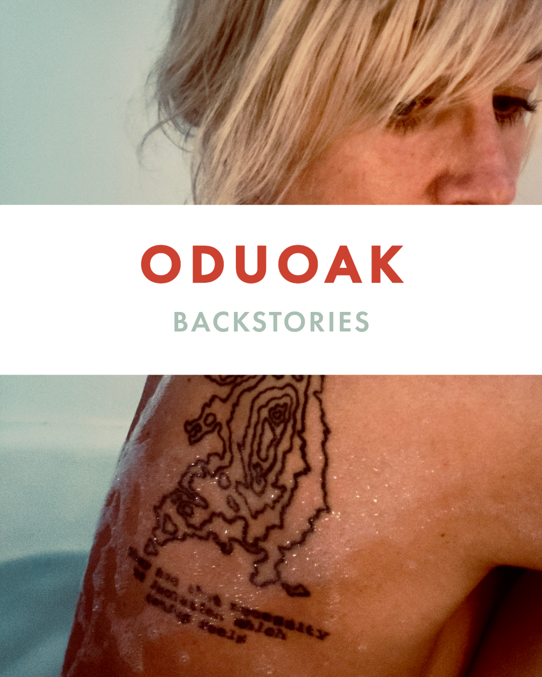

Something old, something new…
A winter weekend in Maine and a surprise encounter that changed the trajectory of the next chapter.
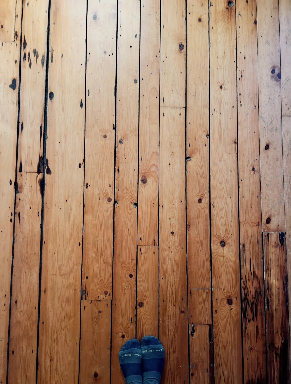
I found myself sitting in a house with gorgeously worn wooden floors, overlooking a lobster company on the coast of Maine. Facing towards the sea wondering where the snow was in December, I wrestled with my original intention to lock myself in solitude and record podcast episodes. The wind was aggressive, the air was frigid, and the mug of tea in my hand was far too comfortable in the company of my wool socks and cardigan. Venturing out of the house required effort, time, facing the icy blasts of wind, and would only put me further behind my plan of crossing off a grossly long to-do list. I came here to finish an article. To edit photos for said article. To record podcasts to give attention to Collection No. 39. And to walk the woods, visiting ghosts and connecting with the rhythm that aligns me on the island. In fairness I had also prepared to attend a town cookie swap a friend invited me to, just in case I felt up to being social. And by prepared I mean packed baking sheets and tools in my checked bag, as well as spent my life savings on ingredients on the way into town. So perhaps I wasn’t fully planning to hide away. Which of course, given the scarcity of community back home, was understandable when I have such a beautiful circle of friends on the island. I was going to bake cookies. I was going to leave the house. I was going to then return and cross off as many to do’s as I intended. I was going to invest time and energy into showcasing the recently released collection (there’s typically a new one every year, as they are relics of my experiences had the year prior). Developing a new collection wouldn’t start teasing my brain for another few months. But then I left the house.
I went to a friend’s house to meet up before the cookie swap.
She had a house guest.
The house guest had a dog.
The dog’s name was Biscuit.
Julianne, the house guest with the dog named Biscuit and now a dear friend, came downstairs with her flawless complexion and perfect auburn curls, and we immediately found common ground on the topic of emotionally unavailable men and the suffering they have caused us. Collection No. 40 was born in that moment. Not premature, perfectly on time.
Instantly we recognized the scars on each other’s hearts. She, an artist transplanted from New Jersey, and I, a caged bird fleeing north for the weekend from Kentucky. Both having experienced over and over hard lessons in the form of relationships leading to self abandonment, over giving, mind fuckery, agony, and a state of existential crisis which emerges from a barren pit of lost hope in love. We had both been bullshitted, lied to, cheated on, led on, breadcrumbed, dismissed, discarded, treated as disposable and temporary quick fixes for someone else’s dopamine hit. We had been used for another’s validation, and we had given every ounce we could and then some, certain that if we loved hard enough surely that would move the needle. And we had both been slapped across the face with the reality that it indeed would not. Yet we try again, and again, never letting heartbreak turn us into bitter, lifeless cynics. Waking up every morning and immediately putting on rose colored glasses. Never retreating from the possibility of love and staying open to the magic and endless possibilities. Because truly, the most beautiful thing about being a human is the experience of being in love. Period.
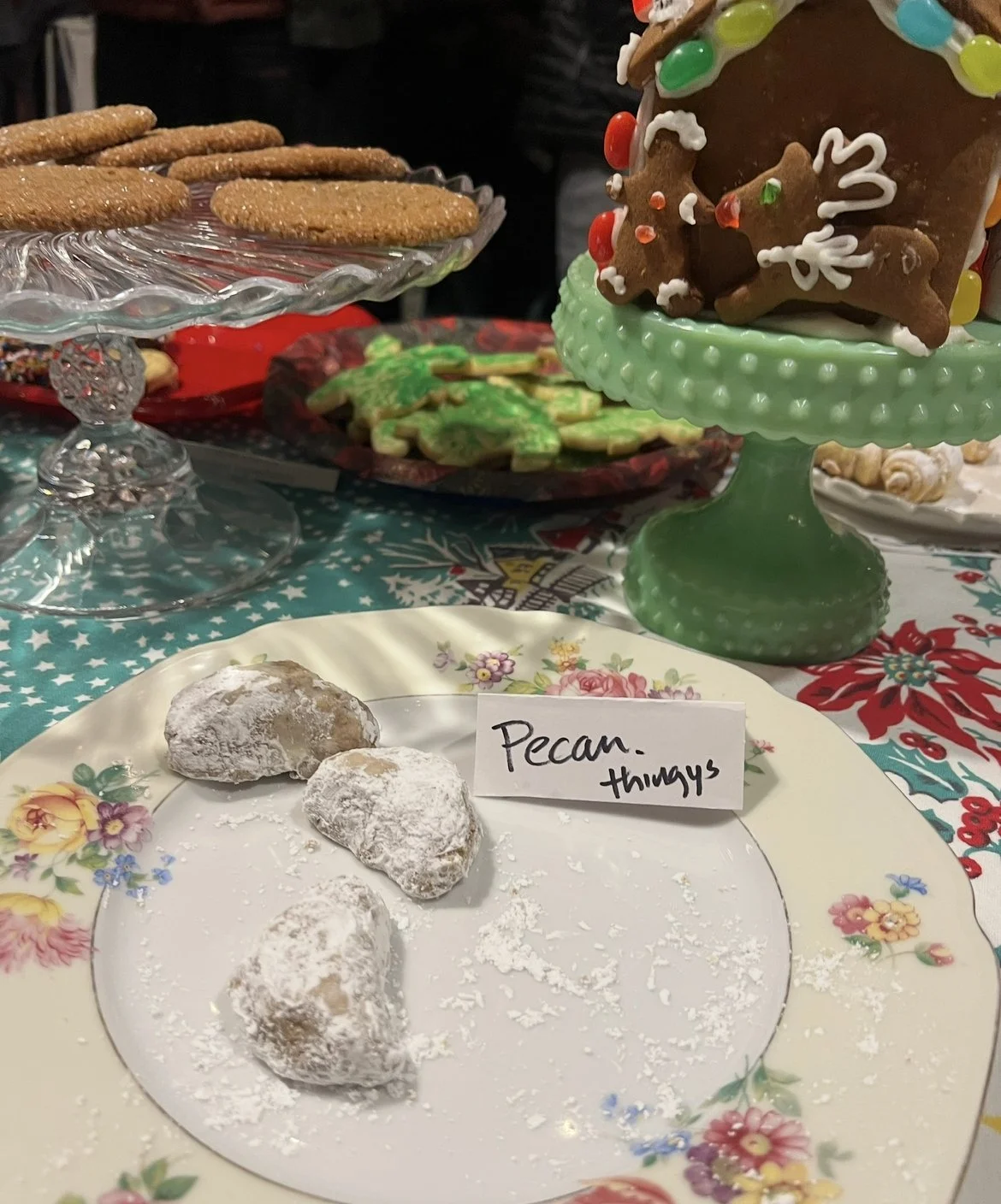
After exchanging war stories, we headed as a group to the cookie swap taking place in a barn in town. Dried flowers and herbs hung from the rafters, amber glowing lights illuminated paintings of romance novel covers hung on the walls, every potential open space was filled with antique platters, home made sweets, champagne cocktails, and warm, friendly islanders. It was perfect. It was the feeling of being in love, manifested into a cozy, crowded, welcoming community. And it was that night that I felt my definition of love shift to something bigger.
Meeting a stranger with such a parallel story in terms of heartbreak shifted my alignment back on course. Previous collections had served to transmute my own tragedies by taking something painful and turning it into something pretty, then spraying it into the air to never return. Collection No.37 and No. 38 both functioned this way. An act of transmutation. No. 39 introduced a way of honoring someone’s energy, capturing it in the form of etheric flower essences, in a way keeping the memory and love alive and present. A completely different approach. What was born the night I met Julianne was something old, something new. A collection inspired by flavors of heartbreak we both understood, incorporating flower essence from the ancient oak on the island the idea was birthed from, and an unapologetic announcement that enough is enough. Creating products from a raw, very vulnerable place was a standard practice. Creating products to connect a community of hopeless romantics who have been reduced to unseen scraps, that is where we are heading.